Date: February 2017 - November 2018
Client: Voya GmbH
Role: Product Designer
Date: February 2017 - November 2018
Client: Voya GmbH
Role: Product Designer
I've got a couple of challenges to face during the redesign process. First of all, eliminating all interceptions within the user flows, mostly caused by lack of clarity in the interface. Secondly to create a new visual language which highlights the options inside the conversations and provides a hierarchical structure. Lastly, to get rid of the immature feeling and give Voya as app and brand a more mature appearance.
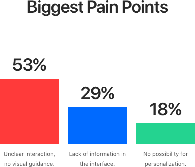
After a few data analysis and user interviews, we've found out that 40% of the options never got booked because of following issues:
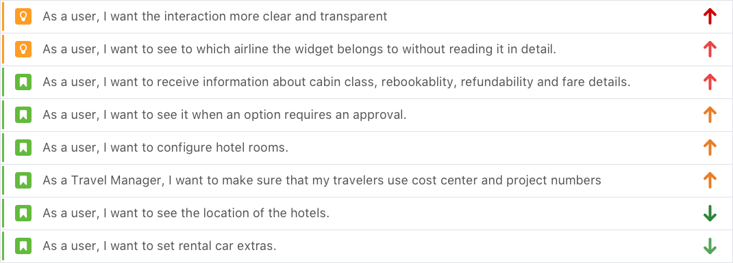
Considering the very basic user needs to use the app and increase the amount of booking through the iOS app we ended up with this requirement list:
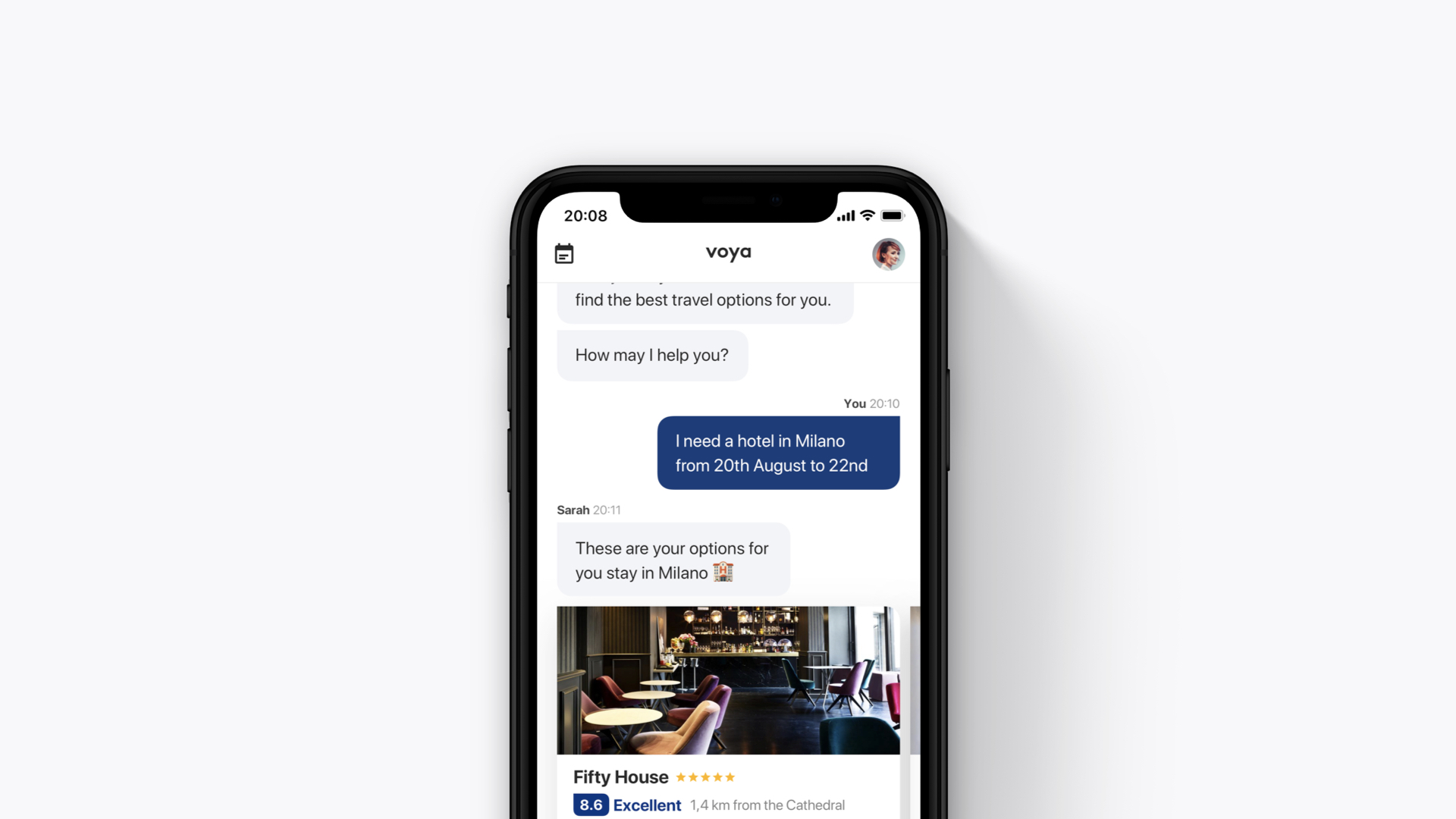
Even after the prioritization, it was hard to find an entry point, to begin with, to not just redesign the app also to create the baseline for a design system. I decided to start with the travel options because, in my opinion, they are the most fundamental element of the whole product. Users request options, agents send options, users select options, the entire ecosystem is built around travel options.
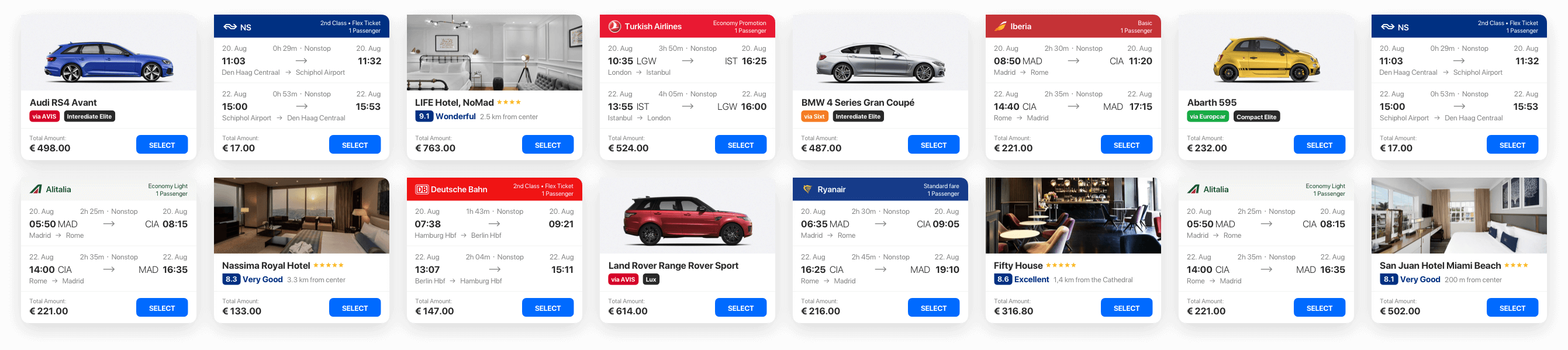
After rethinking the Widgets, I aligned the style of the environment where the conversation view itself. I dropped all existing colors and styles and replaced them with a clean and minimal surface. By doing so, I also opened the way to highlight the options and established a hierarchical structure.
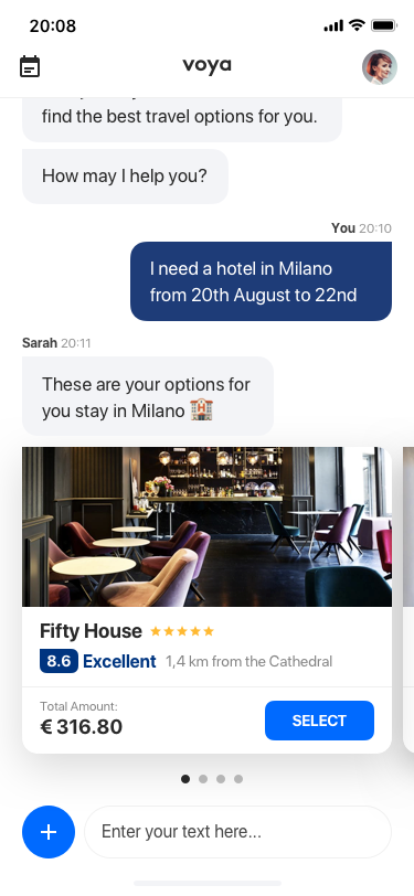
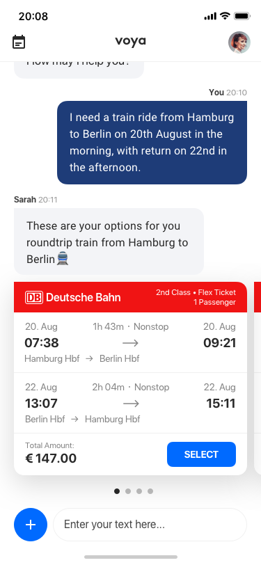
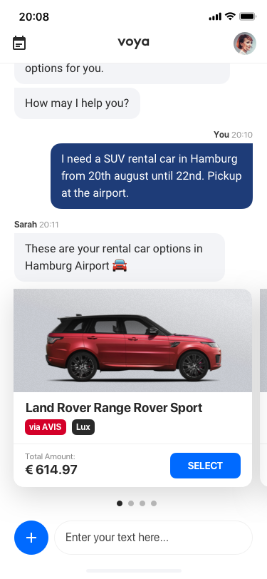
One of my goals was to create a consistent experience through the whole app. I wanted to create a visual language which felt familiar, regardless of what the user is booking. So regardless of what the user was exploring, whether flight, hotel, train or rental car options, the experience was quite the same, the same interactions have been built for all of them.
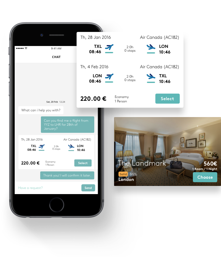
This additional view was not just designed to provide all flight details; the whole concept is based on consistent experience. In the detail view of the options, you can upgrade your flight and train booking class, select and personalize hotel rooms and rental cars. The goal was to increase confidence and enable personalization simultaneously by providing this section.
Here we've two examples of how we've provided users the most uncomplicated way possible to upgrade and personalize their options and being aware of fare details at the same time.
As a cherry on top, I also designed a quick check-out process to eliminate all confidence issues and make sure that cost centers and payment methods are appropriately used.